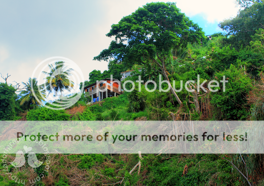
I have spruced this blog up a little in preparation for {hopefully} getting out this summer to take some photos. Over the last year, I haven't really had chance to get out there, but hopefully that will change this summer :)
Do you like the background? LOL....ok I know you can't see much of it...I need to sort that out, but I blurred the photo anyway so that it wouldn't distract people too much when reading the posts.
Do you want to see what the original looked like? I took the pic on a day trip to St Vincent (a small Caribbean island) at the end of 2008. I did some HDR tweaking (kind of overdid it in the top right corner), but I love the end result!
Sunday, 14 March 2010
Subscribe to:
Post Comments (Atom)


I love the green and blue shining through. Blurring it was wise!
ReplyDeleteIt's really nice . I like it. Before I found out how to put tabs horizontally I could not get my pages ligned up like that and it just looked silly , but that's great! I am looking forward to how you got your tabs horizontally without tweaking it and sticking CSS codes in the HTML .
ReplyDeleteJackie with this new template - which should hopefully be released soon, the tabsa are just added like that automatically :)
ReplyDeleteThat's good . I think the template designer is sort of like myspace ! lame . Although it beats paying an arm and a leg for a designer blog . I guess .
ReplyDelete